


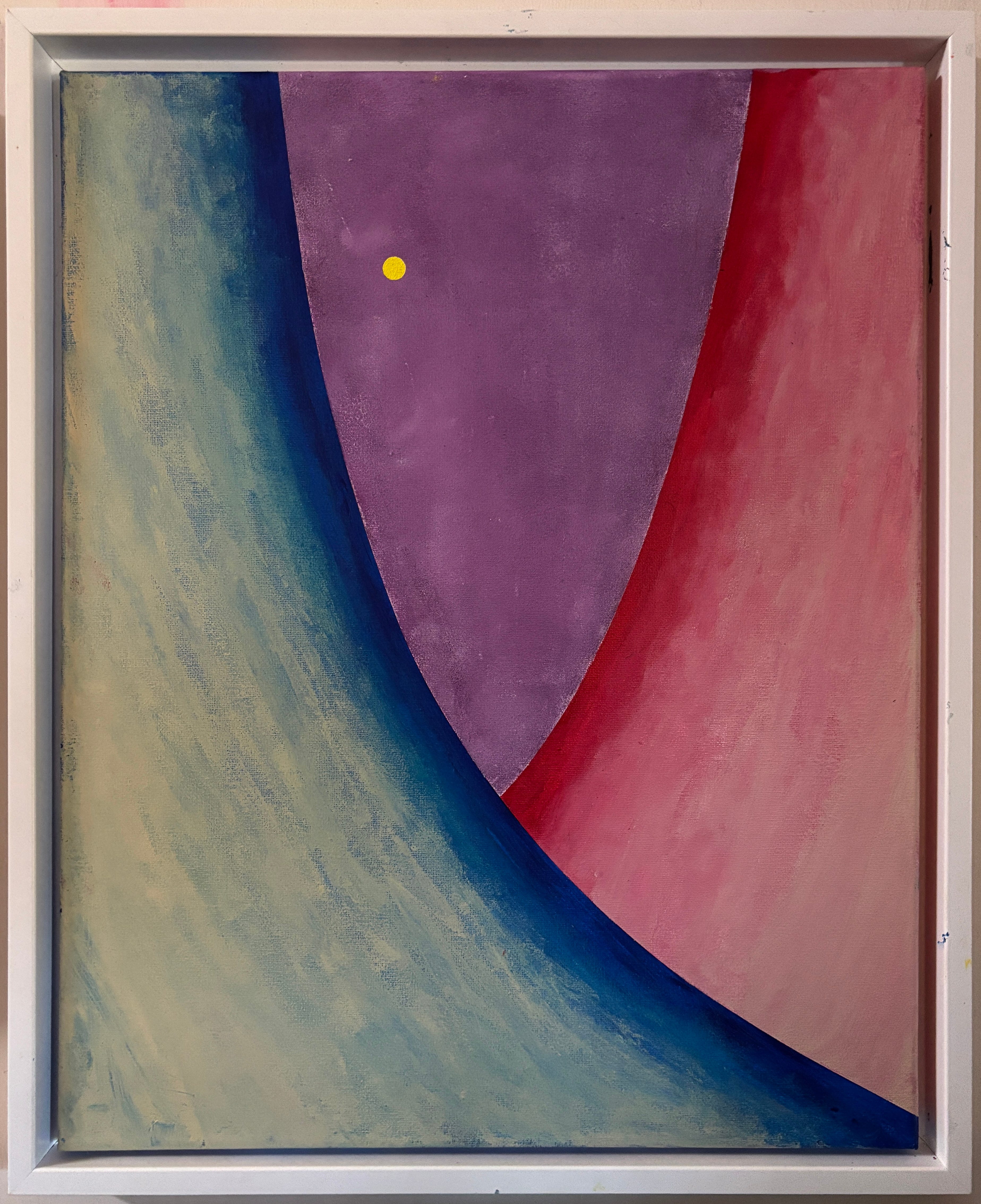
“Gossamer Tranquility” 26 x 20 acrylic 2025
This painting started with the overlapping curves along with very basic blue and red colors. I started to work in the unbleached titanium for the creamy white-ish feel.
I did not want the center part to be jarring, I wanted an overall sense of tranquility. So I combined the three colors and a touch of white for the violet portion to make the transition smoother. The yellow spot is there to help pull the eye through on viewing.
It is presently hanging on my wall (I almost always hang paintings I have just finished.on my wall for a while to get used to them, sometimes for better understanding of them, and to fully realize they are finished). It does add tranquility and depth to my mood when I look at it. Maybe I should leave it up there for a while.
Have the best weekend you can. I’ll be at the Riverside Arts Market today.
Wednesday’s Post
The other post from this week. Don’t forget: Click on the link below to see the full paintings. If you want to see any previous post you can click on the “Art and Sass Home” button. Please comment!
